IntroductionPatterns
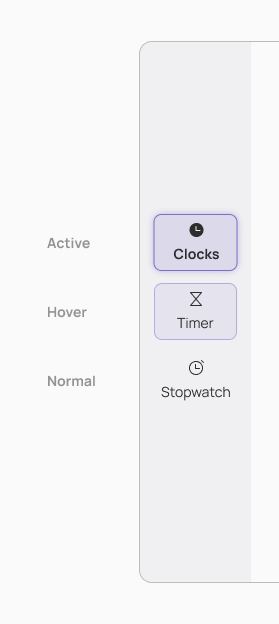
Navigation Rail
Overview

- Use when there's at least 3 and at most 7 different views
- Each view has to be different than the other, because it's meant for destination not filtering
- Each item is 60px×60px in geometry & action target at minimum
- Labels are optional and are needed only if the icon does not describe well what the destination is.
Takeaways
- Puts high-priority destinations within reach on large screens
- Should appear consistently on the same side of each screen in an app
- Complements adaptive and responsive navigation patterns
Tips
- Use a ViewChooser instead of it if you're filtering a concept part of your app.
- Use it in horizontal mode when on a small screen, at the bottom of the app, below any OverlayButtons.
- Based on the language being used, a NavigationRail is set on a screen’s leading edge, left side for left-to-right languages, and right side for right-to-left languages.
Should be used for
- Top-level destinations that need to be accessible anywhere in an app
- Three to seven main destinations in a product
- Tablet or desktop layouts
Shouldn’t be used for
- Small screen sizes in vertical mode.
- Single tasks, such as viewing a single email
- Secondary navigation destinations