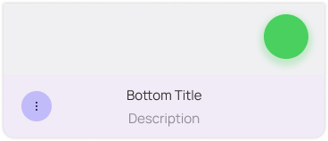
Bottom Bar
Overview

A Bottom Bar is used to store all the action buttons that the View needs and optionally a title and description that describe the view's contents instead of titling the view itself.
The title can be an album's name, a folder's name, etc. while the description is strictly used to showcase how many items is in the View or an important status message.
A Bottom Bar also has by default a background that takes in the accent c olor of your app in a very light form, so your branding has one more place to shine through.
Geometry

The Bottom Bar is 70 units tall, and houses 5 action buttons total per side, reserving the center for the title and description. This center widget may also act optionally as a menu. Each action button is spaced 18 from each other.
If the View has an Overlay Button, it should float above, and not overlay the Bottom Bar, by 18 units of spacing.

When the Window is folded, all the action buttons should be grouped into a secondary menu and take the first slot of the Bottom Bar. This menu should also house the items in the center widget under a different section.