IntroductionGuidelines
App Icon
Overview
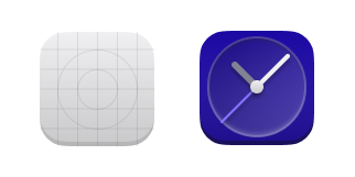
An app's icon should showcase what your app does using only geometric shapes. A good icon should also be universally understandable, meaning that anyone can figure out what your app does just by seeing the icon.
HIG Compliant app icons have must:
- Use a 128×128px canvas size to allow for uniqueness of shape and consistency of visual geometry.
- Make the icon have a corner-radius of 24px, and a size of 104×104px within that 128×128px canvas.
- We recommend that details are at least 4px in either width or height to allow the best appearance when the icon is used at smaller sizes.
- Have a slight bottom-up perspective; this makes part of the front face to show.
- That front face is shaded darker than the top surface, and should be 4px tall.
- The top rim of the icon should be shaded lighter.
- Avoid shadows if possible, they can be used if it is necessary to give contrast to different icon elements.
- Avoid shapes with slight transparency (no more than 20% transparent.)
Once your icon is made, then it can be shipped with your app.
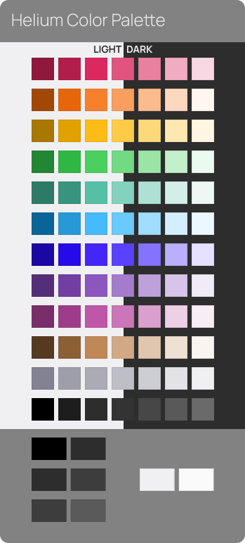
Important: Use the palette below to make your app icons.