IntroductionPatterns
View Switcher
Overview

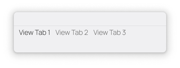
The View Switcher is used when there are multiple views in your app. It displays each View's title which are clickable to navigate to that View.
- The position of the View Switcher should be taken into consideration on whether it's a normal-type one, or a mini-type one.
- Navigation locations should be of equal importance in the app.
- The position of the View Switcher makes primary user journeys easy to access.
- View Switchers provide access to two up to five destinations.
- The destinations may show a badge.

It is positioned at the top of Windows for convenient access. Each destination is represented by a text label, and optional icon. Do not color these, as they should always use the foreground/text color.
When a View Switcher destination is selected, the user is taken to the navigation destination associated with that text label.
Should be used for:
- Top-level destinations that need to be accessible from anywhere in the app.
- Two to five destinations.
Shouldn't be used for:
- Single tasks, such as viewing a single email; in this case use a View Title.
- Displaying a Settings view. Those should be on a Secondary Window.