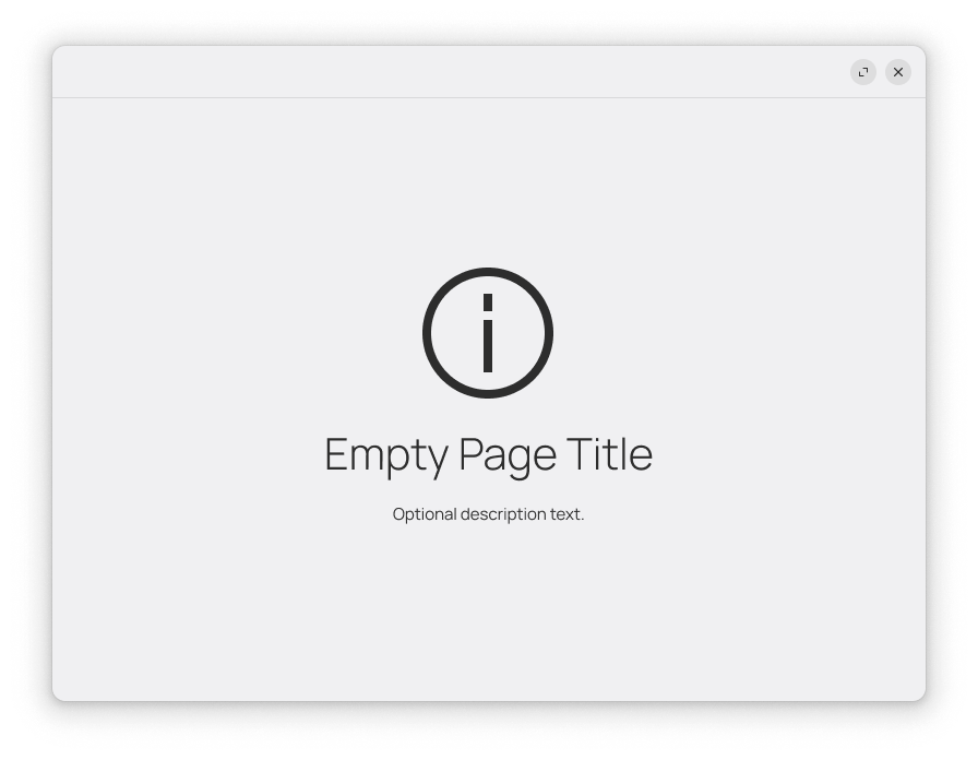
Empty Page
Overview

Empty pages fill a view with an image or a symbolic icon, a title, and a description. They are used to fill a view that would be populated with content.
There are two styles of empty pages: illustration and symbolic. Illustration empty pages use a colorful image, whereas symbolic empty pages use a simple symbolic icon.
Guidelines
All empty pages should include a title which provides guidance. For example, “Empty Folder”.
It is helpful to include a description which provides additional guidance. For example, “Use the + button to add items.”
It can also be a good idea to include buttons that start up adding content to the app. This is one place where an Overlay Button can be appropriate.
If an illustration empty page is used as part of the initial on-boarding experience, the image should be full-color, and the text should be positive in tone and make a relationship with the user by addressing them directly.
Symbolic empty pages should be subtle and not attract attention. Use a symbolic icon and a neutral tone for text.