Banners
Overview

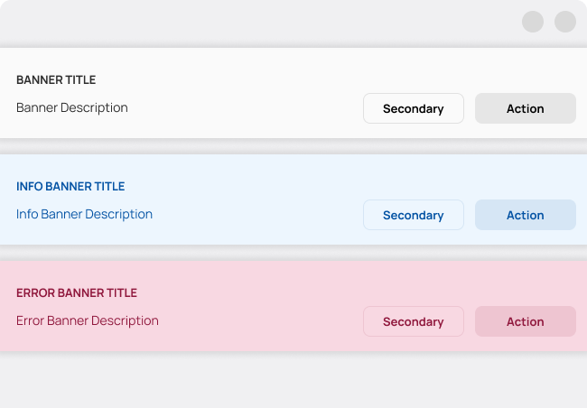
Banners are messages related to the view they're in, and they have up to two related action buttons.
A banner displays an important simple message, and provides action buttons for users to address (or dismiss the banner.) It requires a user action to be dismissed.
Banners should be persistently displayed at the top of the screen, below a App Bar. They allow the user to either ignore, or interact with them at any time. Only one banner should be shown at a time.
They may have an info style or an error style, depending on the tone of the message they wish to convey.
Also, if the view is scrollable, they should stay at their place and not scroll out of view.
Fundamentals
-
Softly Interruptive
Banners are interruptive, but that level of interruption should match the surroundings.
-
Clear & Concise
Banners show a simple message that's actionable by the user.
-
Purposefully Focused
Banners contain a message and actions to take.
Geometry

Banners are full-width, always below the App Bar, and have an elevation shadow of box-shadow: 0 0 8 4 alpha(#000, 0.10).
They are spaced from the App Bar in 6, and have a title and a subtitle. These two have Heading typography style and Body typography style respectively. They also are spaced 12 from each other.
The Banner may also have up to two action buttons, the left one being a secondary action.
The banner is spaced 18 from the rest of the view.