Typography
Overview
An app's interface is nothing without text. Size, position, among other things deliver a great experience in conveying information. Well written and placed text is important to the success of your app.
General Rules
- Use the system font wherever possible. tauOS uses Geist (by Vercel, with our own small changes) [1] at 11pt size.
- Don't place text over a busy background like an image or a gradient, without proper protection with a scrim.
Geometry
Font weights, colors and sizes determine the hierarchy of your app's information. Having too many varying colors and weights makes your app look messy. Make an effort to use only the tauOS Typography font sizes and weights for consistency and to make information easier to read.
- Use lighter text for unimportant information.
- Use darker text for more important information.
- Avoid the use of italics or oblique faces, as they are visually complex and are a distraction.
- Do Not Use Header or Title Case for Everything like This.
- Don't do custom font sizes or styles, as this interferes with accessibility. Use the standard font styles, or use relative font sizes.
Standard Font Styles

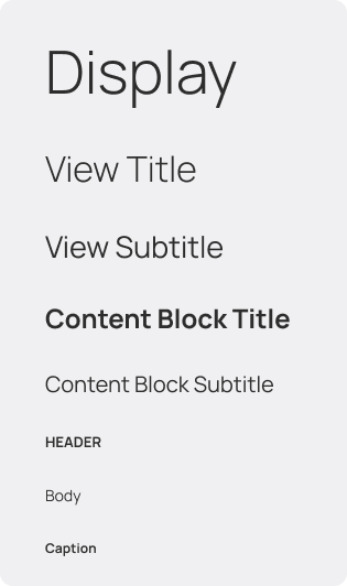
These are the recommended font styles for use in tauOS apps.
| Name | Specs | CSS Class | Usage |
|---|---|---|---|
| Big Display | Regular 57px | .big-display | Used for very large text, such as timers or text that needs to be big. |
| Display | Light 40px | .display | Relatively large text on the screen, display is reserved for short, important text. |
| View Title | Light 32px | .view-title | Used for view titles, it's big enough to title an app's view. |
| View Subtitle | Regular 20px | .view-subtitle | Used for subtitles within a View. |
| Content Block Title | Bold 18px | .cb-title | Used for the titles on Content Blocks. |
| Content Block Subtitle | Regular 15px | .cb-subtitle | Used for the subtitles on Content Blocks. |
| Header | ALL-CAPS BOLD 10px | .header | Used for headings in a Sidebar. |
| Body | Regular 11px | .body (is the default) | Used for all the text on the interface. |
| Caption | Bold 9px | .caption | For sub-text that accompanies a text body or an image. |
Note: These CSS classes are available on both GTK4 and GTK3.
Unicode Advantage
Unicode provides a wide variety of symbols which, when used correctly, can improve the aesthetics given by your app. These Unicode characters are recommended:
| Use | Symbol | Unicode Code to Use |
|---|---|---|
| Quotations | “quote” | U+201C Left double quotation mark, U+201D Right double quotation mark |
| Time | 4∶20 | U+2236 Ratio |
| Multiplication | 1024×768 | U+00D7 Multiplication sign |
| Ellipsis | Introducing… | U+2026 Horizontal ellipsis |
| Apostrophe | The user’s preferences | U+2019 Right single quotation mark |
| Bullet List | • One | U+2022 Bullet |
| Ranges | June–July 1967 | U+2013 En dash |
| Units | 32 GB | U+202F Narrow no-break space |
| Links | Link → | U+2192 Rightwards Arrow |